苹果与微软的字体对比
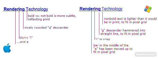
苹果公司和微软公司,对于如何在电脑屏幕上显示字体,总是有不同看法。目前,这两家公司都使用次像素渲染(subpixel rendering)技术,使得字体在低分辨率的屏幕上,也能显得很清晰。这两家公司的根本不同之处在于指导思想。
* 苹果公司通常认为,字体算法的首要目的,是尽可能多得保持原始设计的样子,即使有损屏幕显示的清晰性,也在所不惜。
* 微软公司通常认为,字体的形状一定要适应像素的限制,要保证屏幕显示不模糊、容易辨识,即使字体的形状因此背离原始设计,也在所不惜。
现在,Safari[1]的Windows版本已经发布了。这个软件克服了许多困难,才将苹果公司的字体渲染算法,用到了Windows操作系统上。这实际上给了你一个机会,在同一台显示器上直接比较两种不同的字体哲学。这有助于你理解我下面要举的例子。我想通过比较,你会注意到两者的不同。苹果系统的字体给人有一点毛茸茸的感觉,边界不是很清晰。但是,从电脑屏幕上看,在不同的字体族(font family)之间,它会显示出更多的变化。原因是苹果公司的渲染算法,比微软公司更忠实于字体的原始设计,能够像印刷品那样,在高清晰度状态下,呈现出字体设计中的细微差别。
这种差别的源头,来自于苹果公司的历史传统,苹果公司一贯非常重视桌面出版和平面设计。它的算法有一个好处,就是当你在电脑中打开针对印刷品的设计稿,你在屏幕上看到的,与最终印刷出来的样子很接近。当你判断一个文本区域的颜色深浅时,这个特性尤其有用。微软公司的处理方法是让字体尽量适应像素的分布,这意味着微软其实不在乎,让字母毛茸茸的边缘被一根根细线替代,即使因此文本在屏幕上显示的颜色比印刷时浅,也无所谓。
微软的处理方法也有一个好处,就是有利于对着屏幕阅读。微软公司信奉实用主义的观点,认定字体的原始设计并不是神圣不可侵犯的,锐利的、便于阅读的屏幕显示更为重要,不一定非拘泥于字体设计师对文本颜色深浅的原始安排不可。这就是说,微软公司设计出的字体主要是为了屏幕显示,比如Georgia字体和Verdana字体,它们完全按照像素的位置设计,在屏幕上确实很漂亮,但是印刷出来后却乏善可陈。
苹果公司正好相反,它选择风格化的路线,将艺术性置于实用性之上。原因很简单,就是苹果公司的创始人Steve Jobs很有品味,而微软公司宁愿选择一条风险较小的路线,这条路线采纳实用主义观点,只要能够达到使用目的就行,完全没有让人眼前一亮的亮点。这么说吧,如果苹果公司是Target连锁超市,那么微软公司就是沃尔玛[2]。
好了,现在到了讨论关键问题的时候:用户喜欢哪一种处理方法?Jeff Atwood写过一篇文章,对这两种字体技术进行了逐一比较。不难想像,他的文章引起了热烈的反响。苹果公司的用户喜欢苹果的方法,微软公司的用户喜欢微软的方法。这并不完全都是粉丝情结(fanboyism)。它反映了一个事实,如果你问人们喜欢怎样的风格和设计,除非这些人受过专门训练,否则他们一般会选择自己最熟悉的品种。在最常见的品味这个问题上,如果你做一个偏好调查,你会发现大多数人根本不知道应该怎么选择,他们只好选一个自己最熟悉的答案。这种现象到处都是,不管是字体应用或平面设计,还是选购银器(人们挑选小时候用过的样式)。除非受过专门训练,明确知道自己想要什么,否则人们挑中的就是自己最熟悉的。
这就是为什么当苹果公司的工程师,将苹果电脑上的软件移植到Windows系统上时,他们可能会觉得自己正在为Windows用户做出巨大贡献,将自家“优越的”字体渲染技术提供给异教徒使用。这也解释了为什么Windows用户通常认为,Safari上的字体有点模糊,看上去怪怪的。这些用户不知道原因,他们只是不喜欢这样。实际上,他们心里想的是,“哇噢!这和我使用的系统不一样。我不喜欢有差异。为什么我对这些字体没有好感?嗯,当我靠近仔细一看,这些字体有点模糊。这肯定就是我不喜欢它们的原因了。”

注释:
[1] Safari是苹果公司Mac OS X操作系统的内置浏览器。
[2] 按照销售额计算,沃尔玛是美国最大的零售商,以购物方便、齐全而著称。Target连锁超市则是美国第五大零售商,经常会搞一些别出心裁的推广活动。比如,2006年感恩节前,Target请来著名魔术师大卫·布莱恩,把他吊在时代广场上空的一个圆球里旋转两天,让他表演如何自己解脱,吸引了成千上万的游人,而且被电视、报纸、互联网等各类媒体广为报道。
原文:
Font smoothing, anti-aliasing, and sub-pixel rendering
by Joel Spolsky
Apple and Microsoft have always disagreed in how to display fonts on computer displays. Today, both companies are using sub-pixel rendering to coax sharper-looking fonts out of typical low resolution screens. Where they differ is in philosophy.
Apple generally believes that the goal of the algorithm should be to preserve the design of the typeface as much as possible, even at the cost of a little bit of blurriness.
Microsoft generally believes that the shape of each letter should be hammered into pixel boundaries to prevent blur and improve readability, even at the cost of not being true to the typeface.
Now that Safari for Windows is available, which goes to great trouble to use Apple’s rendering algorithms, you can actually compare the philosophies side-by-side on the very same monitor and see what I mean. I think you’ll notice the difference. Apple’s fonts are indeed fuzzy, with blurry edges, but at small font sizes, there seems to be much more variation between different font families, because their rendering is truer to what the font would look like if it were printed at high resolution.
(Note: To see the following illustration correctly, you need to have an LCD monitor with pixels arranged in R,G,B order, like mine. Otherwise it’s going to look different and wrong.)
The difference originates from Apple’s legacy in desktop publishing and graphic design. The nice thing about the Apple algorithm is that you can lay out a page of text for print, and on screen, you get a nice approximation of the finished product. This is especially significant when you consider how dark a block of text looks. Microsoft’s mechanism of hammering fonts into pixels means that they don’t really mind using thinner lines to eliminate blurry edges, even though this makes the entire paragraph lighter than it would be in print.
The advantage of Microsoft’s method is that it works better for on-screen reading. Microsoft pragmatically decided that the design of the typeface is not so holy, and that sharp on-screen text that’s comfortable to read is more important than the typeface designer’s idea of how light or dark an entire block of text should feel. Indeed Microsoft actually designed font faces for on-screen reading, like Georgia and Verdana, around the pixel boundaries; these are beautiful on screen but don’t have much character in print.
Typically, Apple chose the stylish route, putting art above practicality, because Steve Jobs has taste, while Microsoft chose the comfortable route, the measurably pragmatic way of doing things that completely lacks in panache. To put it another way, if Apple was Target, Microsoft would be Wal-Mart.
Now, on to the question of what people prefer. Jeff Atwood’s post from yesterday comparing the two font technologies side-by-side generated rather predictable heat: Apple users liked Apple’s system, while Windows users liked Microsoft’s system. This is not just standard fanboyism; it reflects the fact that when you ask people to choose a style or design that they prefer, unless they are trained, they will generally choose the one that looks most familiar. In most matters of taste, when you do preference surveys, you’ll find that most people don’t really know what to choose, and will opt for the one that seems most familiar. This goes for anything from silverware (people pick out the patterns that match the silverware they had growing up) to typefaces to graphic design: unless people are trained to know what to look for, they’re going to pick the one that is most familiar.
Which is why Apple engineers probably feel like they’re doing a huge service to the Windows community, bringing their “superior” font rendering technology to the heathens, and it explains why Windows users are generally going to think that Safari’s font rendering is blurry and strange and they don’t know why, they just don’t like it. Actually they’re thinking… “Whoa! That’s different. I don’t like different. Why don’t I like these fonts? Oh, when I look closer, they look blurry. That must be why.”
作者:Joel Spolsky [译者:阮一峰]
 RSS
RSS


